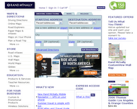
Rand McNally is the king of the paper map world and it should stay there.
User Friendliness
One is given the option between driving directions and "map" which is just driving directions sans an end point. The screen is very busy and one has to scroll to find a button to open up the map in a java script window.
When one can finally view a map there is the option to control what clicking on the map does. Zoom levels are explained on the side so guess work is done away with.
Driving Directions
The long term directions went well until the end. They had me drive to the opposite end of town and taking an odd way into town.
The short term directions were good but I needed to know the exact addresses. There was no option for businesses or "yellow-page" like searches.
Map quality and quantity
The user is granting a Rand McNally road map; period. No photo or satellite view; no special road view; no selective layers; nothing. One is told where they can view the map they are looking at on a Rand McNally paper atlas. This gives the feel of a fancy promo.
Extras
None. Not one.
Summary
It is not that there is anything wrong with Rand McNally; it is just not there is anything special about it to recommend it to friends.
No comments:
Post a Comment